Expo Router’s submodule NativeTabs renders a real Material 3 navigation bar on Android and its native counterpart on iOS from one component tree.
On Android, the active indicator pill and touch ripple come from the platform itself, so you do not need to animate them.
The following approach is tested with Expo SDK 56 with a development build. You can create your own example app using bunx create-expo-app. Also remember, the minimum SDK version supported by NativeTabs is SDK 54.
One import
To import the NativeTabs API, all you need is to add the following where you add your native tabs code. In Expo’s default template, that is src/components/app-tabs.tsx file.
import { NativeTabs } from 'expo-router/unstable-native-tabs';Tabs are a route group in Expo Router
Expo Router follows file-based navigation system to allow you to add and/or remove new routes from the app. These routes are defined inside src/app/(tabs)/ directory.
The navigation bar itself lives inside src/components/app-tabs.tsx where a component AppTabs is exported and imported inside src/app/_layout.tsx, which is the root layout file of the Expo project.
The following example has four tabs:
import { NativeTabs } from 'expo-router/unstable-native-tabs';

export default function AppTabs() {
  return (
    <NativeTabs>
      <NativeTabs.Trigger name="index">
        <NativeTabs.Trigger.Label>Today</NativeTabs.Trigger.Label>
      </NativeTabs.Trigger>

      <NativeTabs.Trigger name="activity">
        <NativeTabs.Trigger.Label>Activity</NativeTabs.Trigger.Label>
      </NativeTabs.Trigger>

      <NativeTabs.Trigger name="search">
        <NativeTabs.Trigger.Label>Search</NativeTabs.Trigger.Label>
      </NativeTabs.Trigger>

      <NativeTabs.Trigger name="settings">
        <NativeTabs.Trigger.Label>Settings</NativeTabs.Trigger.Label>
      </NativeTabs.Trigger>
    </NativeTabs>
  );
}
In the above snippet, note that the name prop points to a route file and it should exist inside (tabs)/. For example, name="index" is (tabs)/index.tsx. The Label prop is the text under the icon in the navigation bar.
What you get before you style anything
When you run the above example on an Android Emulator or device, you already get the navigation bar in Material 3:
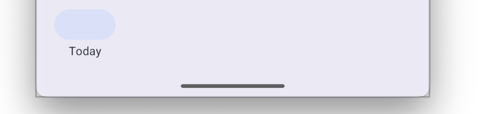
Notice that the default colors uses by the Material 3 bar are lavender-gray for the surface and blue-gray for the pill behind the active destination.
In the previous code snippet, you haven’t added any styling prop. This causest the gap here that tabs have no icons because Android and iOS read from different icon sets.