Introduction
Whether you are a web developer or mobile app developer, you know that without the proper styling of your application, the UI would probably suck. Styling an application is important. I cannot put enough emphasis on how important it is for a mobile app to have a pleasing design and good use of colors.
If you are getting into React Native or have already dipped your toes, you know that there are different ways you can style a React Native app. I have already discussed the basics and some of the different ways to style your React Native components in the article below. Such as, to create a new style object you use **StyleSheet.create()** method and encapsulating them. Go check it out 👇
This tutorial is going to be about styling your React Native apps using 💅 Styled Components. Yes, styled-components is a third party library. Using it is a matter of choice, but also another way to add styling to your app, and many might find it easy to use, especially if you have used this library before with other frameworks. One common use case is web apps built with React.
Table of contents
Open Table of contents
What are Styled Components?
Styled Components is a CSS-in-JS library that enables developers to write each component with their own styles and allows the code to be in a single location. By coupling your styles with the components, it results in optimizing developer experience and output.
In React Native, the styling of components is already done by creating JavaScript objects and if you do not encapsulate them, in most cases, your components and their styling are going to end up in one place.
React Native tends to follow a certain convention when it comes to styling your app. Such as all CSS property names should be in camelCase such as for background-color in React Native is:
backgroundcolor: 'blue';Occasionally, web developers get uncomfortable by these conventions. Using a third party library like styled components can give you wings. You do not have to switch between the context of conventions much, apart from the properties and React Native’s own Flexbox rules.
Behind the scenes, styled components just converts the CSS text into a React Native stylesheet object. You can check how it does that here.
Enough with story, let’s get to work!
Installing Styled Components
To install the styled-components library in a React Native project, we will first initialize the app. To get started quickly, I am going to use the awesome Expo library. Make sure you have expo-cli installed.
# To install expo-cli

npm install -S expo-cli

# Generate a project

expo init [YourApp-Name]
When running the last command, the command line prompt will you a few questions. First one is, Choose a template, where I chose expo-template-blank, then enter display name of your app and then either use npm or yarn to install dependencies. I am using npm.
Once all the dependencies are installed, you can open this project in your favorite code editor. The next step is to install the latest version of styled-components library.
npm install -S styled-componentsThat’s it for installation.
Using Styled Components
Open up App.js file and make some modifications.
import React from 'react';
import { StyleSheet, Text, View } from 'react-native';

export default class App extends React.Component {
  render() {
    return (
      <View style={styles.container}>
        <Text>Open up App.js to start working on your app!</Text>
      </View>
    );
  }
}

const styles = StyleSheet.create({
  container: {
    flex: 1,
    backgroundColor: '#fff',
    alignItems: 'center',
    justifyContent: 'center'
  }
});
From your terminal, run the command: npm run ios if you are on macOS. For Linux and Windows users the command is npm run android, but make sure you have an Android virtual device running in the background. Our code currently looks like below.
Let’s make some changes to it and use our newly installed library. To get started, import the library like below.
import styled from 'styled-components';Make changes to the component’s render function like below. Replace both View and Text with Container and Title. These new elements are going to be custom using semantics from styled-components.
export default class App extends React.Component {
  render() {
    return (
      <Container>
        <Title>React Native with 💅 Styled Components</Title>
      </Container>
    );
  }
}
styled-components utilizes tagged template literals to style your components using backticks. When creating a component in React or React Native using styled-components, each component is going to have styles attached to it.
Notice the Container is a React Native View and has styling attached to it.
const Container = styled.View`
flex: 1;
background-color: papayawhip;
justify-content: center;
align-items: center;
`;
const Title = styled.Text`
font-size: 20px;
font-weight: 500;
color: palevioletred;
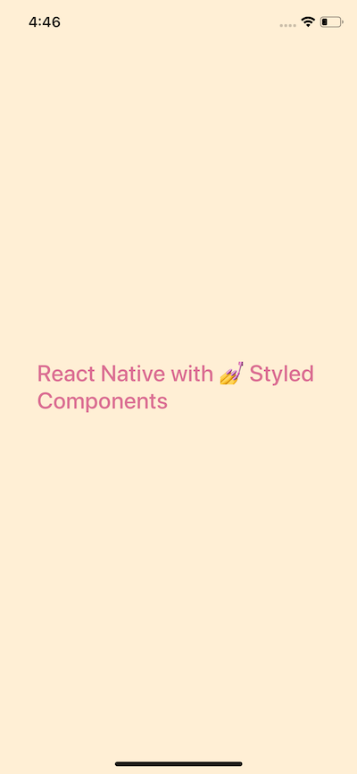
`;The complete code for App.js file after changes.
import React from 'react';
import styled from 'styled-components';

export default class App extends React.Component {
  render() {
    return (
      <Container>
        <Title>React Native with 💅 Styled Components</Title>
      </Container>
    );
  }
}

const Container = styled.View`
  flex: 1;
  background-color: papayawhip;
  justify-content: center;
  align-items: center;
`;

const Title = styled.Text`
  font-size: 24px;
  font-weight: 500;
  color: palevioletred;
`;
In the above snippet, do take a note that we are not importing a React Native core components such as View, Text, or the StyleSheet object. It is that simple. It uses the same flexbox model that React Native Layouts. The advantage here is that you get the advantage of using the same understandable syntax that you have been using in web development and standard CSS.
Using Props in Styled Components
Often you will find yourself creating custom components for your apps. This does give you the advantage to stay DRY. Using styled-components is no different. You can leverage this programming pattern by building custom components that require their parent components. props are commonly known as additional properties to a specific component. To demonstrate this, create a new file called CustomButton.js.
Inside this file, we are going to create a custom button that requires props such as backgroundColor, textColor and the text itself for the button. You are going to use TouchableOpacity and Text to create this custom button but without importing react-native library using a functional component CustomButton.
import React from 'react';
import styled from 'styled-components';
const CustomButton = props => (
<ButtonContainer
onPress={() => alert('Hi!')}
backgroundColor={props.backgroundColor}
>
<ButtonText textColor={props.textColor}>{props.text}</ButtonText>
</ButtonContainer>
);
export default CustomButton;
const ButtonContainer = styled.TouchableOpacity`
width: 100px;
height: 40px
padding: 12px;
border-radius: 10px;
background-color: ${props => props.backgroundColor};
`;
const ButtonText = styled.Text`
font-size: 15px;
color: ${props => props.textColor};
text-align: center;
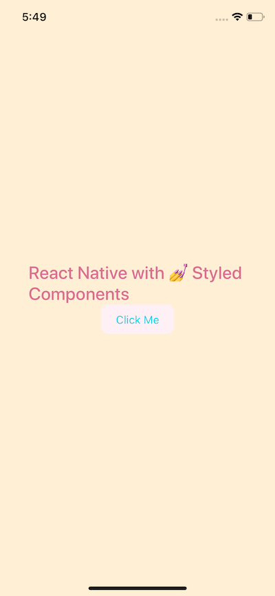
`;By passing an interpolated function ${props => props...} to a styled component’s template literal you can extend its styles. Now add this button to App.js file.
render() {
		return (
			<Container>
				<Title>React Native with 💅 Styled Components</Title>
				<CustomButton text="Click Me" textColor="#01d1e5" backgroundColor="lavenderblush" />
			</Container>
		);
  }
On running the simulator, you will get the following result.
Building the app — Grocery UI
In this section we are building a UI screen for an app that would be used for a grocery store. You are going to build the home screen that looks like the one below.
We will be using our knowledge of styled-components so let’s get started! Open up App.js. Declare a new Container View using styled. Inside the backticks, you can put pure CSS code there with the exact same syntax. The View element is like a div in HTML or web programming in general. Also, create another view called Titlebar inside Container.
Inside Titlebar, it will contain three new elements. One is going to be an image Avatar and the other two are text: Titleand Name.
import React from 'react';
import styled from 'styled-components';
export default class App extends React.Component {
render() {
return (
<Container>
<Titlebar>
<Avatar />
<Title>Welcome back,</Title>
<Name>Aman</Name>
</Titlebar>
</Container>
);
}
}
const Container = styled.View`
flex: 1;
background-color: white;
justify-content: center;
align-items: center;
`;
const Titlebar = styled.View`
width: 100%;
margin-top: 50px;
padding-left: 80px;
`;
const Avatar = styled.Image``;
const Title = styled.Text`
font-size: 20px;
font-weight: 500;
color: #b8bece;
`;
const Name = styled.Text`
font-size: 20px;
color: #3c4560;
font-weight: bold;
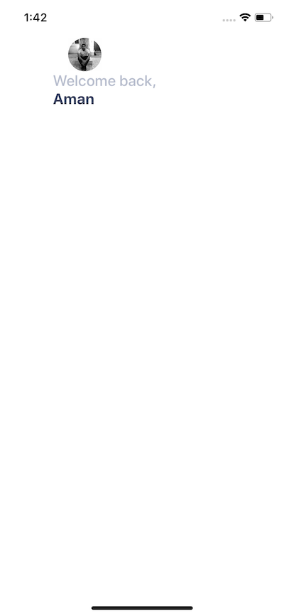
`;Run npm run ios and see it in action.
Right now, the content is in the middle of the screen. We need the Titlebar and its contents at the top of the mobile screen. So styles for Container will be as below.
const Container = styled.View`
  flex: 1;
  background-color: white;
`;
Adding user avatar image
I am going to use an image that is stored in assets folder in the root of our project. You are free to use your own image but you can also download the assets for this project below.
amandeepmittal/react-native-workspace _⚛️ + 📱 React Native Things. Contribute to amandeepmittal/react-native-workspace development by creating an account on…_github.com
To create an image with styled-components, you need the Image component. You can use the source props to reference the image based on where it is located.
<Titlebar>
  <Avatar source={require('./assets/avatar.jpg')} />
  <Title>Welcome back,</Title>
  <Name>Aman</Name>
</Titlebar>
The styling for Avatar will begin with a width and height of 44 pixels. Having a border-radius exactly half the value of width and height, which makes the image a circle. border-radius is the property that you will be using frequently to create rounded corners.
const Avatar = styled.Image`
width: 44px;
height: 44px;
background: black;
border-radius: 22px;
margin-left: 20px;
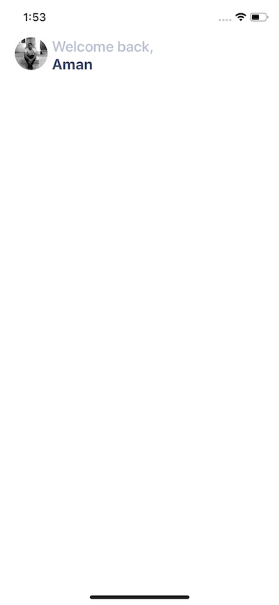
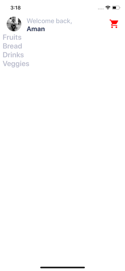
`;You will get the following result.
Now notice that the avatar image and the text are piling up. They are taking the same space on the screen. To avoid this, you are going to use position: absolute CSS property.
Absolute Positioning in React Native
CSS properties such as padding and margin are used to add space between UI elements in relation to one another. This is the default layout position. However, you are currently in a scenario where it will be beneficial to use absolute positioning of UI elements and place the desired UI element at the exact position you want.
In React Native and CSS in general, if position property is set to absolute, then the element is laid out relative to its parent. CSS has other values for position but React Native only supports absolute.
Modify Avatar styles as below.
const Avatar = styled.Image`
  width: 44px;
  height: 44px;
  background: black;
  border-radius: 22px;
  margin-left: 20px;
  position: absolute;
  top: 0;
  left: 0;
`;
Usually, with position absolute property, you are going to use a combination of the following properties:
- top
- left
- right
- bottom
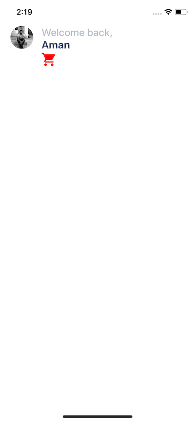
In our case above, we use top and left both set to 0 pixels. You will get the following output.
Adding icons in a React Native
Expo boilerplate comes with a set of different icon libraries such as Ionicons, FontAwesome, Glyphicons, Material icons and many more. The complete list of icons you can find here, a searchable website.
To use the library, all you have to do is write the import statement.
import { Ionicons } from '@expo/vector-icons';Inside the Titlebar view, add the icon.
<Titlebar>
{/* ... */}
<Ionicons name="md-cart" size={32} color="red" />
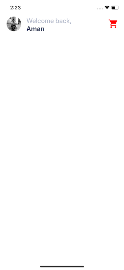
</Titlebar>Each icon needs props for the name that you can choose, size and color. Right now, if you look at the simulator, you will notice the same problem we had when adding the avatar image. There is no space between the icon and other UI elements inside the title bar.
To solve this, let us use the absolute positioning property as an inline style to <Ionicons />.
<Ionicons
  name="md-cart"
  size={32}
  color="red"
  style={{ position: 'absolute', right: 20, top: 5 }}
/>
Why an inline style? Because Ionicons is not generated using styled-components.
Mapping through a List
Inside components/ folder create a new file called Categories.js. This file is going to render a list of category items for the Grocery UI app.
import React from 'react';
import styled from 'styled-components';

const Categories = props => (
  <Container>
    <Name>Fruits</Name>
    <Name>Bread</Name>
    <Name>Drinks</Name>
    <Name>Veggies</Name>
  </Container>
);

export default Categories;

const Container = styled.View``;

const Name = styled.Text`
  font-size: 32px;
  font-weight: 600;
  margin-left: 15px;
  color: #bcbece;
`;
All the data is static right now. Import this component in App.js and place it after Titlebar.
import Categories from './components/Categories';

// ...

return (
  <Container>
    <Titlebar>{/* ... */}</Titlebar>
    <Categories />
  </Container>
);
You will get the following output.
There can be a number of categories. To make the names of categories dynamic, we can send it through App.jsfile.
const Items = [
  { text: 'Fruits' },
  { text: 'Bread' },
  { text: 'Drinks' },
  { text: 'Veggies' },
  { text: 'Meat' },
  { text: 'Paper Goods' }
];

// Inside the render function replace <Categories /> with

{
  items.map((category, index) => (
    <Categories name={category.text} key={index} />
  ));
}
In the above snippet, you are using the map function from JavaScript to iterate through an array render a list of items, in this category names. Adding a key prop is required. To make this work, also modify Categories.js.
const Categories = props => <Name>{props.name}</Name>;Adding Horizontal ScrollView
This list is right now not scrollable. To make it scrollable, let us place it inside a ScrollView. Open up App.js file place the categories inside a ScrollView, but first, import it from React Native core.
import { ScrollView } from 'react-native';
// ...
<ScrollView>
{items.map((category, index) => (
<Categories name={category.text} key={index} />
))}
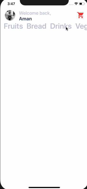
</ScrollView>;You will notice not a single change in the UI. By default scrollable lists in React Native using ScrollView are vertical. Make this horizontal by adding the prop horizontal.
<ScrollView horizontal={true}>
{items.map((category, index) => (
<Categories name={category.text} key={index} />
))}
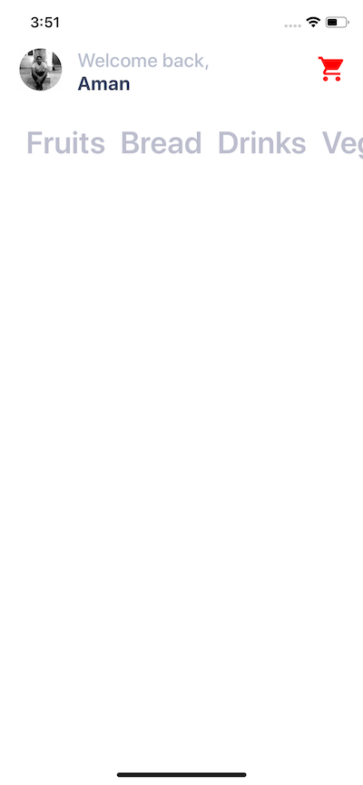
</ScrollView>It works but does not looks good.
Let us add some inline styles to the ScrollView.
<ScrollView
horizontal={true}
style={{
padding: 20,
paddingLeft: 12,
paddingTop: 30,
flexDirection: 'row'
}}
showsHorizontalScrollIndicator={false}
>
{items.map((category, index) => (
<Categories name={category.text} key={index} />
))}
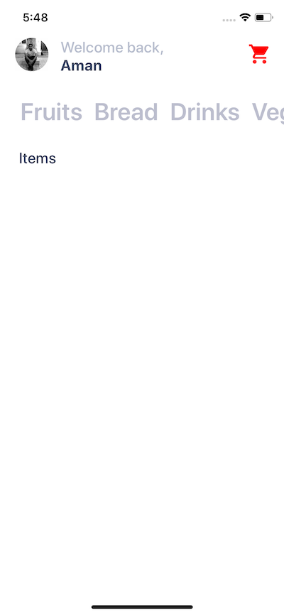
</ScrollView>Now it looks better. The prop showsHorizontalScrollIndicator hides the horizontal scroll bar that by default appears beneath the name of the categories.
Adding a vertical ScrollView
Next step is to add a ScrollView that acts as a wrapper inside the Container view such that the whole area becomes scrollable vertically. There is a reason to do this. You are now going to have items separated into two columns as images with texts related to a particular category.
Modify App.js file.
return (
  <Container>
    <ScrollView>
      <Titlebar>{/* and its contents */}</Titlebar>
      <ScrollView horizontal={true}>
        {/* Categories being rendered */}
      </ScrollView>
      <Subtitle>Items</Subtitle>
    </ScrollView>
  </Container>
);
Notice that we are adding another styled component called Subtitle which is nothing but a text.
const Subtitle = styled.Text`
  font-size: 20px;
  color: #3c4560;
  font-weight: 500;
  margin-top: 10px;
  margin-left: 25px;
  text-transform: uppercase;
`;
It renders like below.
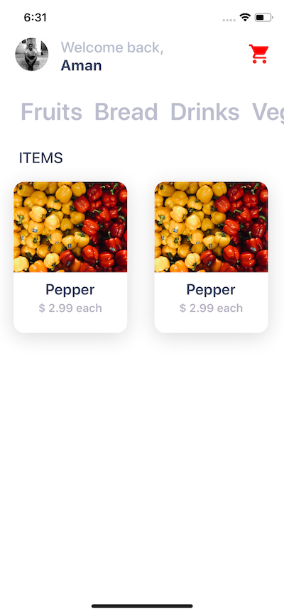
Building a card component
In this section, we are going to create a card component that will hold an item’s image, the name of the item and the price as text. Each card component is going to have curved borders and box shadow. This is how it is going to look like.
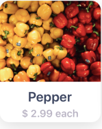
Create a new component file called Card.js inside components directory. The structure of the Card component is going to be.
import React from 'react';
import styled from 'styled-components';

const Card = props => (
  <Container>
    <Cover>
      <Image source={require('../assets/pepper.jpg')} />
    </Cover>
    <Content>
      <Title>Pepper</Title>
      <PriceCaption>$ 2.99 each</PriceCaption>
    </Content>
  </Container>
);

export default Card;
Currently, it has static data, such as the image, title, and content. Let us add the styles for each styled UI elements in this file.
const Container = styled.View`
  background: #fff;
  height: 200px;
  width: 150px;
  border-radius: 14px;
  margin: 18px;
  margin-top: 20px;
  box-shadow: 0 5px 15px rgba(0, 0, 0, 0.15);
`;

const Cover = styled.View`
  width: 100%;
  height: 120px;
  border-top-left-radius: 14px;
  border-top-right-radius: 14px;
  overflow: hidden;
`;

const Image = styled.Image`
  width: 100%;
  height: 100%;
`;

const Content = styled.View`
  padding-top: 10px;
  flex-direction: column;
  align-items: center;
  height: 60px;
`;

const Title = styled.Text`
  color: #3c4560;
  font-size: 20px;
  font-weight: 600;
`;

const PriceCaption = styled.Text`
  color: #b8b3c3;
  font-size: 15px;
  font-weight: 600;
  margin-top: 4px;
`;
The Container view has a default background of white color. This is useful in scenarios where you are fetching images from a third party APIs. Also, it provides a background to the text area below the image.
Inside the Container view, add an Image and wrap it inside a Cover view. In React Native there two ways you can fetch an image
If you are getting an image from the static resource as in our case, you use source prop with keyword require that contains the relative path to the image asset stored in the project folder. In case of networking images or getting an image from an API, you use the same prop with a different keyword called uri. Here is an example of an image being fetched from an API.
<Image
  source={{
    uri: 'https://facebook.github.io/react-native/docs/assets/favicon.png'
  }}
/>
The Cover view uses rounded corners with overflow property. This is done to reflect the rounded corners. iOS clips the images if coming from a child component. In our case, the image is coming from a Card component which is a child to App component.
The Image component takes the width and height of the entire Cover view.
Now let us import this component inside App.js file, after the Subtitle and let us see what results do we get.
render() {
	return (
	<Container>
		<ScrollView>
		{/* ... */}
		<Subtitle>Items</Subtitle>
			<ItemsLayout>
				<ColumnOne>
					<Card />
				</ColumnOne>
				<ColumnTwo>
					<Card />
				</ColumnTwo>
			</ItemsLayout>
		</ScrollView>
	</Container>
	)
}

// ...

const ItemsLayout = styled.View`
	flex-direction: row;
	flex: 1;
`;

const ColumnOne = styled.View``;

const ColumnTwo = styled.View``;
After Subtitleadd a new view called ItemsLayout. This is going to be a layout that allows different cards to be divided between two columns in each row. This can be done by giving this view a flex-direction property of value row. ColumnOne and ColumnTwo are two empty views.
On rendering the screen of the simulator, looks like below.
Conclusion
Have you tried styled-components with React Native before? If not, are you going to try it now in your next project? Do comment below if you do or do not find styled-components a comfortable way to use in your React Native applications. You can extend this application too! Let your imagination wander. You are welcome to submit a PR if you decide to do so.
You can find the complete code for this article in the Github repo 👇