Creating native iOS experiences in React Native is about using platform conventions. One of these patterns that Apple offers is the large header title that smoothly collapses as you scroll through a list, something you must have seen in Apple’s apps like Settings or Messages.
In this post, let’s dive into how to use the large header title when using Expo Router library for iOS.
Understanding large header titles
Before jumping into code, it is worth understanding what makes the large headers special. In SwiftUI, navigationBarTitleDisplayMode property is used to control the display mode of a title in the navigation bar. The concept starts when as an app user, you land on a screen and the large title gives you immediate context about the screen you are on. This screen also contains a scrollable list of items. As you scroll through the list, the title smoothly collapses to a smaller size (regular title), providing an efficient use of space when you’re engaged with the content of the screen.
To see it live, open the Settings app on your iOS device and scroll through the list of settings options. As you start scrolling through the list of options, you will see that the large title smoothly transitions into a compact header that stays visible at the top of your screen. There is also a blur effect that automatically kicks in behind the regular title on iOS 26.
Here’s an example of a large header title enabled for a screen on iOS 26 Simulator:
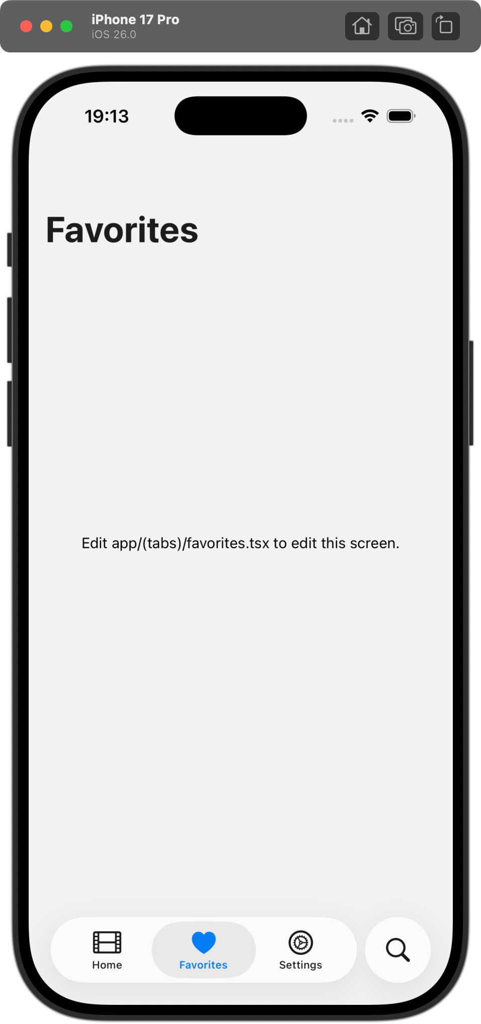
For list views, these large header titles can collapse into a regular headers when you scroll through the list:
Prerequisites
- An iOS Simulator/device that can run iOS 26
- An iOS Simulator/device that can run iOS 18
- Android Emulator/device (optional)
Setting up the navigation
Without going into too much detail, let’s go through the overview of the navigation structure of the example app you will be using in this post. Establishing the understanding is important to understand the navigation flow of the example app.
example-app/
├── app/
│ ├── \_layout.tsx (Root Stack)
│ └── (tabs)/
│ ├── \_layout.tsx (Native Tabs)
│ ├── (home)/
│ │ ├── \_layout.tsx (Home Stack)
│ │ └── index.tsx (Home Screen)
│ ├── favorites/
│ │ ├── \_layout.tsx (Favorites Stack)
│ │ └── index.tsx (Favorites Screen)
│ ├── search/
│ │ ├── \_layout.tsx (Search Stack)
│ │ └── index.tsx (Search Screen)
│ └── settings/
│ ├── \_layout.tsx (Settings Stack)
│ └── index.tsx (Settings Screen)
└── package.json
Nothing fancy, just a standard bottom tab-based app where each tab has its own stack navigator. The whole example follows the recommended navigation pattern from Expo Router’s file-based routing system and there is nothing complex about it.
Basic implementation
The focus is on the HomeLayout which lives inside the app/(tabs)(home)/\_layout.tsx file. The layout is responsible for displaying a title on the screen:
import { Stack } from 'expo-router';

export default function HomeLayout() {
  return (
    <Stack>
      <Stack.Screen
        name="index"
        options={{
          title: 'Home'
        }}
      />
    </Stack>
  );
}
The index.tsx file in the same directory is responsible for displaying a list of items:
import { ScrollView, Text } from 'react-native';

export default function Index() {
  return (
    <ScrollView contentContainerStyle={{ padding: 16 }}>
      {Array.from({ length: 100 }).map((_, index) => (
        <Text key={index} style={{ paddingVertical: 4 }}>
          Item {index}
        </Text>
      ))}
    </ScrollView>
  );
}
Enabling large header titles for home screen
To enable large header title for the home screen, you need to set the headerLargeTitle prop to true on the Stack.Screen component in app/(home)/_layout.tsx file:
import { Stack } from 'expo-router';

export default function HomeLayout() {
  return (
    <Stack>
      <Stack.Screen
        name="index"
        options={{
          title: 'Home',
          headerLargeTitle: true,
          headerTransparent: true
        }}
      />
    </Stack>
  );
}
In the above code example, the headerTransparent prop is also set to true to ensure that the header stays transparent for blur effect to work.
The next step is to add set contentInsetAdjustmentBehavior to automatic on the ScrollView component in index.tsx file:
import { ScrollView, Text } from 'react-native';

export default function Index() {
  return (
    <ScrollView
      contentContainerStyle={{ padding: 16 }}
      contentInsetAdjustmentBehavior="automatic"
    >
      {Array.from({ length: 100 }).map((_, index) => (
        <Text key={index} style={{ paddingVertical: 4 }}>
          Item {index}
        </Text>
      ))}
    </ScrollView>
  );
}
The contentInsetAdjustmentBehavior prop is essential. It tells the ScrollView to automatically adjust its content insets to account for the navigation bar. If you are using a different list component, such as FlatList, you will use this prop on that component instead.
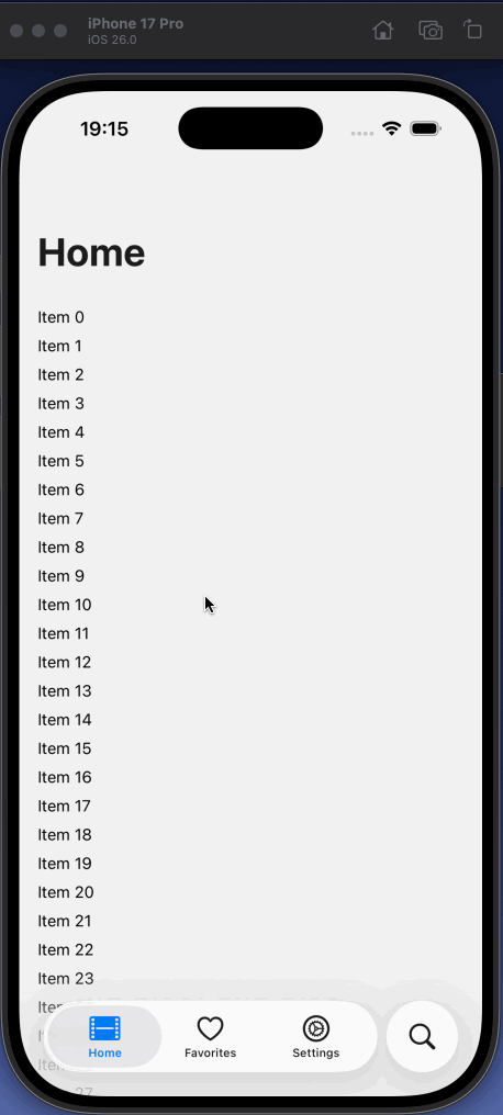
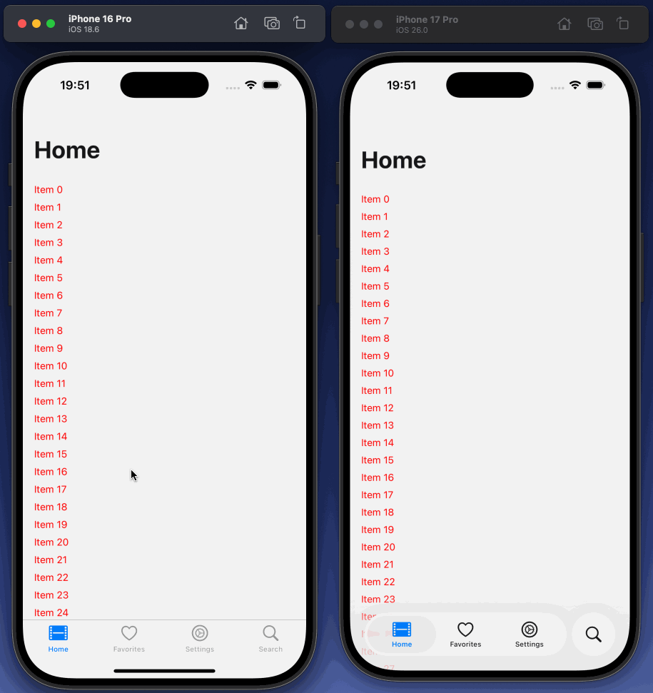
Result of this configuration so far is the expected result. On an iOS Simulator running 26 version, you will see the large header title enabled for the home screen and smoothly collapsing into a regular title:
The iOS 18 problem
Here’s where things get interesting. If you test this on an iOS 18, you will notice that a blur effect is not applied behind the regular title. That is because pre-iOS 26 versions need an explicit blur configuration to work. You can achieve this by setting the headerBlurEffect prop to regular:
import { Stack } from 'expo-router';
export default function HomeLayout() {
return (
<Stack>
<Stack.Screen
name="index"
options={{
title: 'Home',
headerLargeTitle: true,
headerTransparent: true,
headerBlurEffect: 'regular'
}}
/>
</Stack>
);
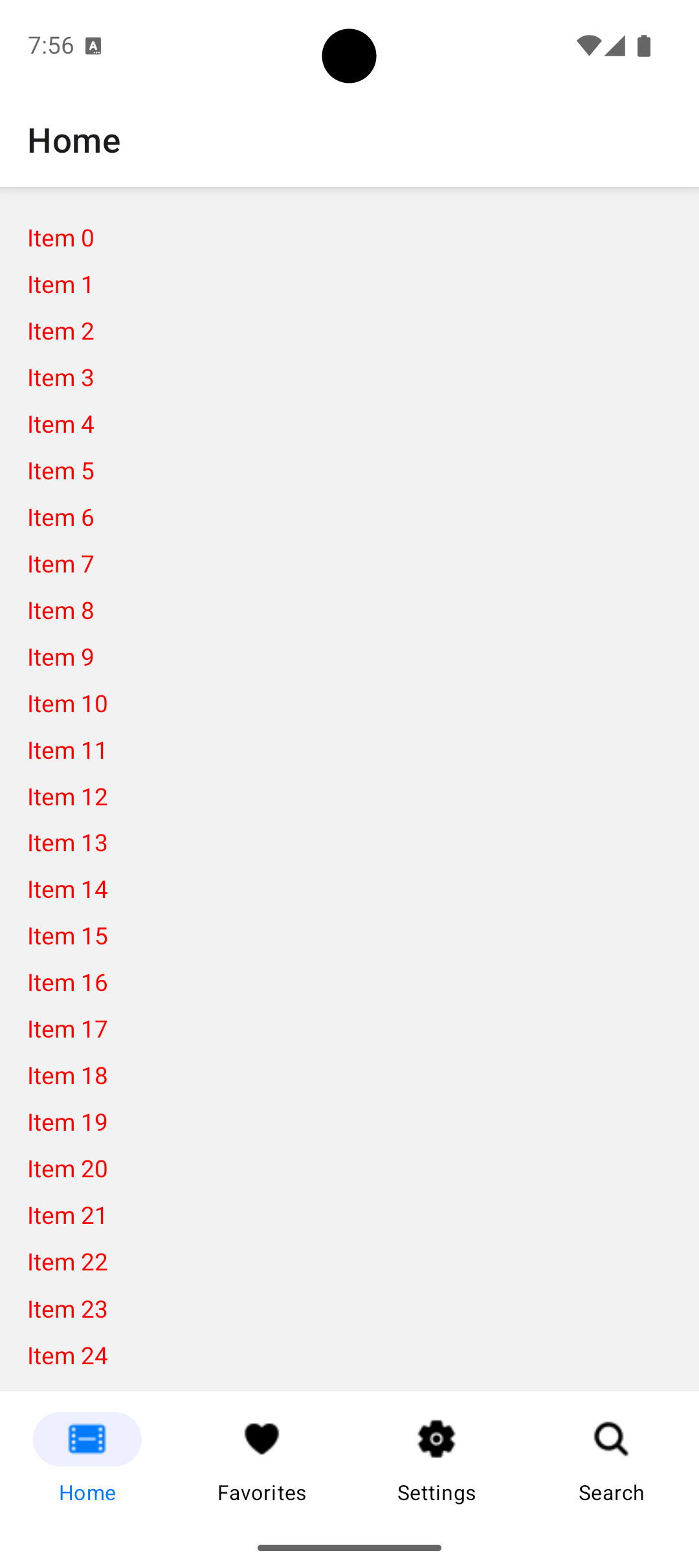
}On running the app on an iOS 18, you will see the blur effect applied behind the regular title:
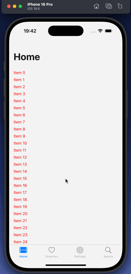
Note: I’ve set the text string color to
redin/(home)/index.tsxfor an easier demonstration of the blur effect in the header.
iOS version specific implementation
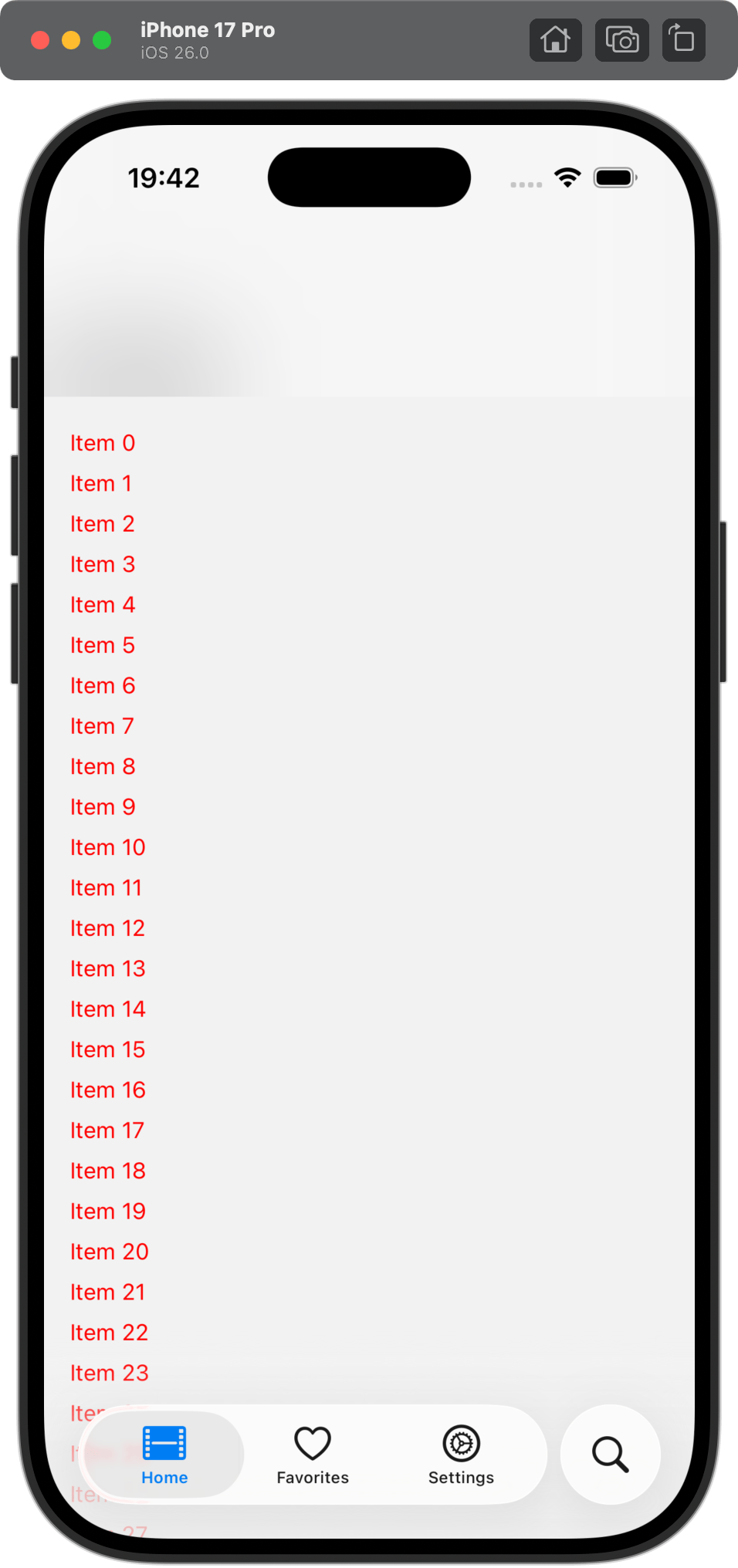
After applying the headerBlurEffect prop on the home screen, when you go back to the iOS 26 Simulator, you will notice that the large header title is disappearing behind the blur effect explicitly applied. Not exactly the behavior you want.
Since iOS 26 can handle applying blur effect automatically, you can use the following approach:
- Detect the iOS version using
Platform.Version - Conditionally apply
headerBlurEffectprop for iOS 18
Update the code in /(home)/_layout.tsx file to include the following:
import { Stack } from 'expo-router';
import { Platform } from 'react-native';

function getIOSVersion(): number {
  if (Platform.OS !== 'ios') return 0;

  return parseInt(Platform.Version as string, 10);
}

function isIOS26OrLater(): boolean {
  return getIOSVersion() >= 26;
}

export default function HomeLayout() {
  return (
    <Stack>
      <Stack.Screen
        name="index"
        options={{
          title: 'Home',
          headerLargeTitle: true,
          headerTransparent: true,
          headerBlurEffect: isIOS26OrLater() ? undefined : 'regular'
        }}
      />
    </Stack>
  );
}
This change will satisfy both iOS versions:
Don’t forget Android
One last detail. These large header titles are an iOS pattern and headerTransparent prop makes the header really transparent on Android. To fix this, you need to conditionally set headerTransparent prop’s value to true only for iOS, as I’ve shared in an earlier post:
export default function HomeLayout() {
  return (
    <Stack>
      <Stack.Screen
        name="index"
        options={{
          title: 'Home',
          headerLargeTitle: true,
          headerTransparent: Platform.OS === 'ios',
          headerBlurEffect: isIOS26OrLater() ? undefined : 'regular'
        }}
      />
    </Stack>
  );
}
Result on Android:
Wrapping up
The version check might feel like a hack, but it’s actually respecting how the platform evolved. iOS 26 improved the API by making blur automatic. We’re just adapting to that improvement while maintaining backward compatibility.
