
Formik and yup are great development tools to build awesome looking UI forms as per your React Native application needs. You will get the full context of this statement by the end of this tutorial when I walk you through in this post, to build two forms for login and signup screens, and showcase how easy it is to validate them using the combination of libraries like Formik and Yup.
This tutorial is going to use some already setup source code from this Github repo release.
Make sure you download the source code in order to follow this post closely and for a better understanding of libraries like Formik and yup. The source code file you are downloading contains the use of navigation patterns like Stack and Switch to fulfill the requirement of mimicking authentication flow in a React Native app. It also contains minimal code for three screens:
- Login
- Signup
- Home
You are going to continue to build on them. For complete detail on how I set up this authentication flow, please follow the previous post How Authentication Flow works in React Native apps using React Navigation 4.x.
Table of Contents
Open Table of Contents
- Requirements
- Installing the libraries
- Creating reusable components
- Create a login form
- Add Formik to the login form
- Handle Form Submission
- Validating form with yup
- Refactor error message
- Disable Button when form is not valid
- Show errors only if touch for specific field
- Show a loading indicator on Login button while submitting
- A challenge for you 💪
- Conclusion
Requirements
If you are going to code along, make sure you have already installed the following:
- Nodejs (>=
10.x.x) with npm/yarn installed. - expo-cli (>=
3.x.x), previously known as create-react-native-app. - Mac users could use an iOS simulator.
- Windows/Linux users must be running an Android emulator.
To know more about how to setup and run the simulator or the emulator on your local development environment visit React Native’s official documentation here.
Installing the libraries
Right now, the package.json file from the previous post looks like the following. It contains a basic Expo blank template and dependencies for react-navigation library.
"dependencies": {
    "expo": "^34.0.1",
    "react": "16.8.3",
    "react-dom": "^16.8.6",
    "react-native": "https://github.com/expo/react-native/archive/sdk-34.0.0.tar.gz",
    "react-native-gesture-handler": "~1.3.0",
    "react-native-reanimated": "~1.1.0",
    "react-native-screens": "1.0.0-alpha.22",
    "react-native-web": "^0.11.4",
    "react-navigation": "4.0.0",
    "react-navigation-stack": "1.5.1"
  },
Install the libraries that are going to be used to create login and signup forms. Open up a terminal window and execute the following command.
yarn add formik yup react-native-elementsThe UI library react-native-elements is a “Cross-Platform React Native UI Toolkit” that makes easy to build various interface components in React Native apps with additional functionalities. It will speed up the development process for this demo.
Creating reusable components
Inside components/ directory create two new files called: FormButton.js and FormInput.js. Both of these components are going to be presentational and reusable in screen components. Open FormButton.js file, import the Button component react-native-elements library.
It is a touchable element that allows the user to interact with the device’s screen and perform the next action. This custom component will receive props for styling and its style. The component library react-native-elements has different ways to style a button.
//FormButton.js
import React from 'react';
import { Button } from 'react-native-elements';

const FormButton = ({ title, buttonType, buttonColor, ...rest }) => (
  <Button
    {...rest}
    type={buttonType}
    title={title}
    buttonStyle={{ borderColor: buttonColor, borderRadius: 20 }}
    titleStyle={{ color: buttonColor }}
  />
);

export default FormButton;
Next, open FormInput.js file. Again, it is going to be a custom component for a text input field. Import the Input element from react-native-elements. It allows the user to enter the text in a form UI. It receives props as well and since using Expo, vector-icons can be imported without installing a third party dependency manually.
Lastly, notice how the remaining props are passed through an object using rest operator. This is also known as rest parameter syntax. Make sure the order of the props remains same as below. That is, the ...rest comes before other props in the FormInput component, as it won’t be able to override those other properties.
import React from 'react';
import { Input } from 'react-native-elements';
import { StyleSheet, View } from 'react-native';
import { Ionicons } from '@expo/vector-icons';

const FormInput = ({
  iconName,
  iconColor,
  returnKeyType,
  keyboardType,
  name,
  placeholder,
  value,
  ...rest
}) => (
  <View style={styles.inputContainer}>
    <Input
      {...rest}
      leftIcon={<Ionicons name={iconName} size={28} color={iconColor} />}
      leftIconContainerStyle={styles.iconStyle}
      placeholderTextColor="grey"
      name={name}
      value={value}
      placeholder={placeholder}
      style={styles.input}
    />
  </View>
);

const styles = StyleSheet.create({
  inputContainer: {
    margin: 15
  },
  iconStyle: {
    marginRight: 10
  }
});

export default FormInput;
Create a login form
Now that the custom components are all set up, let us create a login screen component. Open screens/Login.js file and import all required statements. Then, without changing the state or any handler functions from the previous base repo you downloaded and are following for this tutorial, let us straight dive into the render method of the Login component.
import React from 'react';
import { StyleSheet, SafeAreaView, View } from 'react-native';
import { Button } from 'react-native-elements';
import FormInput from '../components/FormInput';
import FormButton from '../components/FormButton';

export default class Login extends React.Component {
  state = {
    email: '',
    password: ''
  };

  handleEmailChange = email => {
    this.setState({ email });
  };

  handlePasswordChange = password => {
    this.setState({ password });
  };

  onLogin = async () => {
    const { email, password } = this.state;
    try {
      if (email.length > 0 && password.length > 0) {
        this.props.navigation.navigate('App');
      }
    } catch (error) {
      alert(error);
    }
  };

  goToSignup = () => this.props.navigation.navigate('Signup');
  render() {
    const { email, password } = this.state;

    return (
      <SafeAreaView style={styles.container}>
        <FormInput
          name="email"
          value={email}
          placeholder="Enter email"
          autoCapitalize="none"
          onChangeText={this.handleEmailChange}
          iconName="ios-mail"
          iconColor="#2C384A"
        />
        <FormInput
          name="password"
          value={password}
          placeholder="Enter password"
          secureTextEntry
          onChangeText={this.handlePasswordChange}
          iconName="ios-lock"
          iconColor="#2C384A"
        />
        <View style={styles.buttonContainer}>
          <FormButton
            buttonType="outline"
            onPress={this.handleOnLogin}
            title="LOGIN"
            buttonColor="#039BE5"
          />
        </View>
        <Button
          title="Don't have an account? Sign Up"
          onPress={this.goToSignup}
          titleStyle={{
            color: '#F57C00'
          }}
          type="clear"
        />
      </SafeAreaView>
    );
  }
}

const styles = StyleSheet.create({
  container: {
    flex: 1,
    backgroundColor: '#fff'
  },
  buttonContainer: {
    margin: 25
  }
});
Notice, inside the SafeAreaView there are two FormInput fields and two buttons, out of which, one is the custom button previously created. The properties on input fields such as secureTextEntry and autoCapitalize are unique to each input field. Thus, this where the rest parameter syntax comes in handy. Also, notice how the type of both buttons will make a UI difference in the output below.

Add Formik to the login form
Formik is a small library that helps forms to be organized in React and React Native with the following things:
- it keeps track of form’s state
- handles form submission via reusable methods and handlers (such as
handleChange,handleBlur, andhandleSubmit) - handles validation and error messages out of the box
At times it becomes hard to manage and fulfill the above points. Using Formik, you can understand what exactly is happening in forms and write fewer lines of code. Created by Jared Palmer it has a great API to refer.
To get started, open Login.js file and import the library.
//Login.js

// ... with other import statements
import { Formik } from 'formik';
Next, inside the SafeAreaView use Formik as the wrapper element. It comes with different props to handle forms such as initialValues and onSubmit handler method. The initialValues accepts an object containing form values. In the case of the current form, these values are going to be email and password. The onSubmit method accepts a function that has these values as the first argument to handle the form submission.
Lastly, the third method used in Formik is the render method itself. It follows the Render Prop pattern. Take a look at the Login component below.
export default class Login extends React.Component {
  goToSignup = () => this.props.navigation.navigate('Signup');
  render() {
    return (
      <SafeAreaView style={styles.container}>
        <Formik
          initialValues={{ email: '', password: '' }}
          onSubmit={values => {}}
        >
          {formikProps => (
            <Fragment>
              <FormInput
                name="email"
                value={values.email}
                onChangeText={formikProps.handleChange('email')}
                placeholder="Enter email"
                autoCapitalize="none"
                iconName="ios-mail"
                iconColor="#2C384A"
              />
              <FormInput
                name="password"
                value={values.password}
                onChangeText={formikProps.handleChange('password')}
                placeholder="Enter password"
                secureTextEntry
                iconName="ios-lock"
                iconColor="#2C384A"
              />
              <View style={styles.buttonContainer}>
                <FormButton
                  buttonType="outline"
                  onPress={formikProps.handleSubmit}
                  title="LOGIN"
                  buttonColor="#039BE5"
                />
              </View>
            </Fragment>
          )}
        </Formik>
        <Button
          title="Don't have an account? Sign Up"
          onPress={this.goToSignup}
          titleStyle={{
            color: '#F57C00'
          }}
          type="clear"
        />
      </SafeAreaView>
    );
  }
}
The value prop in each of the above input fields is given the initial value from the formikProps. It is passed through each render function that provides access to the state of the form as initialValues. You have to define these values just as you would do in the state of a class component. Other than that, it also gives access to handle the change of each input field (when user types in the email or the password) and a method to submit the form: handleSubmit.
You can refactor the current component into the following:
{
  ({ handleChange, values, handleSubmit }) => (
    <Fragment>
      <FormInput
        name="email"
        value={values.email}
        onChangeText={handleChange('email')}
        placeholder="Enter email"
        autoCapitalize="none"
        iconName="ios-mail"
        iconColor="#2C384A"
      />
      <FormInput
        name="password"
        value={values.password}
        onChangeText={handleChange('password')}
        placeholder="Enter password"
        secureTextEntry
        iconName="ios-lock"
        iconColor="#2C384A"
      />
      <View style={styles.buttonContainer}>
        <FormButton
          buttonType="outline"
          onPress={handleSubmit}
          title="LOGIN"
          buttonColor="#039BE5"
        />
      </View>
    </Fragment>
  );
}
On looking back to the simulator you will notice that Login form looks the same but now on clicking the login button, nothing happens. Let us make it work. The onSubmit prop handles the form submission. Right now, to see that the values of both input field are being recorded, let us add an alert method.
onSubmit={values => { alert(JSON.stringify(values))}}Go back to the login screen and fill both input fields and click the login button. You will get a dialog box stating the values of both email and password.

Handle Form Submission
Now let us add the logic to enter the app whenever the user clicks the login button instead of showing the values they entered in a dialog box. First, add a method on the onSubmit prop on Formik element.
onSubmit={values => {this.handleSubmit(values)}}Next, define the handleSubmit method before the render function.
handleSubmit = values => {
  if (values.email.length > 0 && values.password.length > 0) {
    this.props.navigation.navigate('App');
  }
};
The logic is still the same as it was when you started building this login form. The user can only log in to the app if the email and password fields are not empty. The only difference that the values for both fields were derived from the initial state of the component before.

The custom input component does not need the value prop to be passed on separately.
//FormInput.js
const FormInput = ({
  iconName,
  iconColor,
  returnKeyType,
  keyboardType,
  name,
  placeholder,
  ...rest
}) => (
  <View style={styles.inputContainer}>
    <Input
      {...rest}
      leftIcon={<Ionicons name={iconName} size={28} color={iconColor} />}
      leftIconContainerStyle={styles.iconStyle}
      placeholderTextColor="grey"
      name={name}
      placeholder={placeholder}
      style={styles.input}
    />
  </View>
);
Validating form with yup
The yup library is useful to manage complex validation when using Formik in either React or React Native apps. Formik supports both synchronous and asynchronous form validation. It has support for schema based form level validation from yup.
Import everything from the yup library with other import statements.
import * as yup from 'yup';If you are familiar with Nodejs development, you will find yup library is quite similar to another validation library called joi. Next, let us define a new object before the Login class component called validationSchema.
Since initialValues is an object, you have to specify yup.object() and define a shape of the object. Note that, inside the shape when defining input fields, make sure their name corresponds the same as described in initialValues. Next, each field in this object is supported by a chain of validation methods provided by the yup API. The type of both email and password is going to be a string since the method onChangeText return values as strings.
const validationSchema = Yup.object().shape({
  email: Yup.string()
    .label('Email')
    .email('Enter a valid email')
    .required('Please enter a registered email'),
  password: Yup.string()
    .label('Password')
    .required()
    .min(4, 'Password must have at least 4 characters ')
});
Using a library like Yup saves a lot of time, especially when you do not have to define custom validation methods to check for an input field. For example, in the above snippet, using .email() automatically matches against a regex instead defining regex to check the validity of an email input field.
Also, for every valid method, you can enter a custom return message that’s shown in case of an error. Look at the .required() again at the email in the above code snippet. It’s stating that when an email isn’t provided, this message passed in quotes will be shown as the error message. Similarly, for password, when the length of the input field is less than four characters, it will display an error message. The last step to add the validationSchema to work, is to add a prop with the same name in the Formik element.
<Formik
  initialValues={{ email: '', password: '' }}
  onSubmit={values => {
    this.handleSubmit(values)
  }}
  // new line
  validationSchema={validationSchema}>
  {*/ Rest of the code /*}
</Formik>
Next, formikProps also provide errors to access error messages.
// pass errors below
{({ handleChange, values, handleSubmit, errors }) => (
After each input field, you will have to add a Text element to display the error message. Import it from react-native and then after each input field adds the following.
<FormInput
  name='email'
  value={values.email}
  onChangeText={handleChange('email')}
  placeholder='Enter email'
  autoCapitalize='none'
  iconName='ios-mail'
  iconColor='#2C384A'
/>
<Text style={{ color: 'red' }}>{errors.email}</Text>
<FormInput
  name='password'
  value={values.password}
  onChangeText={handleChange('password')}
  placeholder='Enter password'
  secureTextEntry
  iconName='ios-lock'
  iconColor='#2C384A'
  />
<Text style={{ color: 'red' }}>{errors.password}</Text>
Try to click the login button without entering details in any input field.

Notice, how both the custom error message for the email field and a default message for password is displayed. Now, try to enter an invalid string in the email and a password of fewer than four characters and then submit the login button.
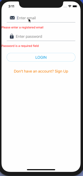
Notice that the error messages change and the correct error message is displayed.
Refactor error message
In this section, let us create a reusable presentational component to display the error messages. Open components/ErrorMessage.js file and add the following.
import React from 'react';
import { View, Text, StyleSheet } from 'react-native';

const ErrorMessage = ({ errorValue }) => (
  <View style={styles.container}>
    <Text style={styles.errorText}>{errorValue}</Text>
  </View>
);

const styles = StyleSheet.create({
  container: {
    marginLeft: 25
  },
  errorText: {
    color: 'red'
  }
});

export default ErrorMessage;
Next, go back to the Login.js file, import this component. Below each input field where there is a Text element, replace it with the newly created custom ErrorMessage.
<FormInput
  name='email'
  value={values.email}
  onChangeText={handleChange('email')}
  placeholder='Enter email'
  autoCapitalize='none'
  iconName='ios-mail'
  iconColor='#2C384A'
/>
<ErrorMessage errorValue={errors.email} />
<FormInput
  name='password'
  value={values.password}
  onChangeText={handleChange('password')}
  placeholder='Enter password'
  secureTextEntry
  iconName='ios-lock'
  iconColor='#2C384A'
  />
<ErrorMessage errorValue={errors.password} />
The error messages are now properly aligned with the input fields.

Disable Button when form is not valid
Formik provides a quicker way to disable the submit button until there is no error shown for any input field. This is done via the prop value of isValid which returns true when there are no errors. The disabled property is added to the FormButton, which is where react-native-elements shine.
 {({ handleChange, values, handleSubmit, errors, isValid, isSubmitting }) => (
            <Fragment>
              {*/ Res of the code remains same /*}
              <View style={styles.buttonContainer}>
                <FormButton
                  buttonType='outline'
                  onPress={handleSubmit}
                  title='LOGIN'
                  buttonColor='#039BE5'
                  disabled={!isValid}
                />
              </View>
            </Fragment>
          )}
Notice that how the colour of the button is changed to grey and it is not clickable at all.

But entering values for input fields it comes back to life.

Show errors only if touch for specific field
If you have noticed that the current state of the form shows errors for both fields even when the user is entering the first field and hasn’t yet seen what is required in the second field.

To fix this, let us use two touched and handleBlur from formikProps.
{({
  handleChange,
  values,
  handleSubmit,
  errors,
  isValid,
  isSubmitting
  touched,
  handleBlur,
}) => ()ThehandleBlur is passed as the value to the onBlur prop on the input field. This prop is used to track whether an input field has been touched by the user or not — the touched tracks what fields have been touched. Using the combination of both, you can get the following behavior.

Here is the code snippet on how to do this. On each input field, add the onBlur prop with the corresponding value passed to handleBlur method.
// on email
onBlur={handleBlur('email')}

// on password
onBlur={handleBlur('password')}
Next, when displaying the error message, modify it is as follows for both fields.
// for email
<ErrorMessage errorValue={touched.email && errors.email} />

// for password
<ErrorMessage errorValue={touched.password && errors.password} />
Show a loading indicator on Login button while submitting
Next, when submitting the login credentials, you do not want the user to press the button twice. formikProps has a solution for this too. Using isSubmitting you can track that when the form is is in submitting phase. Usually, in real-time application, this submitting phase will depend on the asynchronous network call to the server. On the disabled prop, you can use an OR condition to solve this issue.
disabled={!isValid || isSubmitting}To mimic an API call, add a setTimeout function to the handleSubmit method.
handleSubmit = values => {
  if (values.email.length > 0 && values.password.length > 0) {
    setTimeout(() => {
      this.props.navigation.navigate('App');
    }, 3000);
  }
};
Now observe how the button gets disabled when it is touched.

You can add a loading indicator to the button, thanks to the prop with the same name available in react-native-elements.
loading = { isSubmitting };
A challenge for you 💪
Using the knowledge obtained from this tutorial, get it to work and build a signup form that looks like below with for four input fields:
- Name of the user
- Password
- A confirm password
The challenge here is to make sure both fields: password and confirmPassword matches and an appropriate error message are shown is they do not match. To find the solution, lookout for the next post, where you will get the answer to this problem as well as some more functionalities such handling error when the input field is not of type string.
Here is a teaser:

Conclusion
Congratulations 🎉
You just learned how to create, handle, and validate forms in React Native using Formik and Yup. I hope in your production React Native apps, some little tricks used in this tutorial such as in handling buttons and using loading indicators help. You will find the code for this tutorial along with the completed challenge at the this Github repo release.
Important resources used to write this tutorial:
