
Creating a better user experience is one of the most important aspects of any application. This is where animations in mobile applications come into play. Animations are an important part of your mobile application.
Fortunately, for React Native developers, there is recommended a way to create desirable user experiences. It can be achieved through Animated API. For most use cases Animated API provides the best use case to design and create fluid animations.
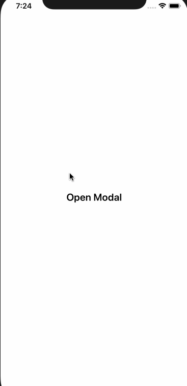
In this tutorial, you are going to take dive deep in creating a custom modal and animated it on a button click. This is the final result we looking to achieve in a React Native application.

Table of Contents
Open Table of Contents
Prerequisites
Here is a complete list of plugins, packages, and tools that you’re going to need in order to follow along.
- Nodejs >=
v8.x.xinstalled along with npm/yarn. watchman, the file change watcher for React Native projects.- Expo CLI >=
v2.19.4.
To get started create a new project using expo-cli toolchain with the following set of commands. The first command will create a new project directory. Make sure you are inside the project when running the application in a simulator environment or a real device.
# create a new bare project
expo-cli init rn-animations

# navigate inside the directory
cd rn-animations

# to start the project
yarn start
We are using yarn to kickstart the app but you are most welcome to use npm or npm scrips or use Expo CLI tool command: expo start. This way you can verify that the project has been created successfully.
Next step is to install different dependencies or libraries that our little demo project is going to depend. Run the below command from a terminal window.
yarn add redux react-redux styled-components @expo/vector-iconsAfter installing these dependencies, this is how package.json file looks like.
{
  "main": "node_modules/expo/AppEntry.js",
  "scripts": {
    "start": "expo start",
    "android": "expo start --android",
    "ios": "expo start --ios",
    "web": "expo start --web",
    "eject": "expo eject"
  },
  "dependencies": {
    "@expo/vector-icons": "^10.0.2",
    "expo": "^33.0.0",
    "react": "16.8.3",
    "react-dom": "^16.8.6",
    "react-native": "https://github.com/expo/react-native/archive/sdk-33.0.0.tar.gz",
    "react-native-web": "^0.11.4",
    "react-redux": "^7.0.3",
    "redux": "^4.0.1",
    "styled-components": "^4.3.1"
  },
  "devDependencies": {
    "babel-preset-expo": "^5.1.1"
  },
  "private": true
}
Setup up Screens
Create two screens inside a new directory called screens/. One is going to be the home screen for the app and the main UI point. The second screen is going to be a normal screen but will behave like a custom modal in terms of UI behavior. You can name them whatever you like but make sure to remember those names.
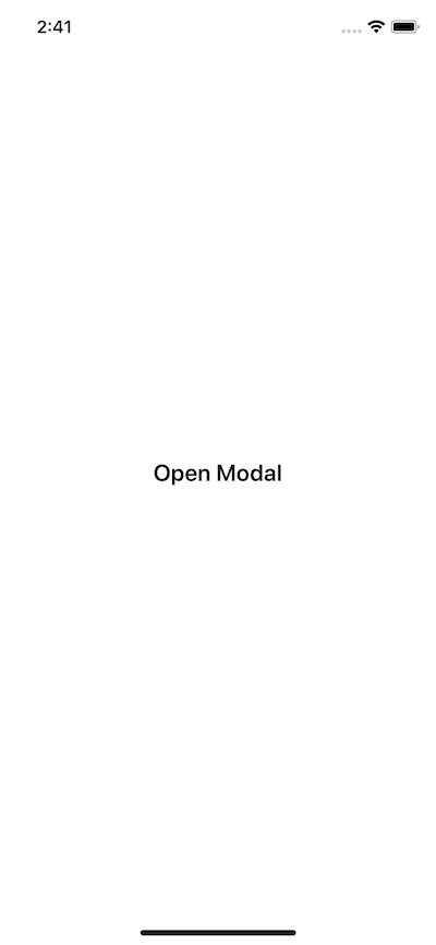
Here is the initial snippet of screens/HomeScreen.js.
import React from 'react';
import styled from 'styled-components';

class HomeScreen extends React.Component {
  render() {
    return (
      <Container>
        <ButtonText>Open Modal</ButtonText>
      </Container>
    );
  }
}

const Container = styled.View`
  flex: 1;
  justify-content: center;
  align-items: center;
`;

const ButtonText = styled.Text`
  font-size: 20px;
  font-weight: 600;
`;

export default HomeScreen;
The above snippet is using styled-components to define new UI elements using React Native API. For more information on to read on how to integrate styled-components and its advantage in a React Native app, please go through this link.
For CustomModal.js:
import React from 'react';
import styled from 'styled-components';

class CustomModal extends React.Component {
  render() {
    return (
      <Container>
        <Text>CustomModal</Text>
      </Container>
    );
  }
}

const Container = styled.View`
  flex: 1;
  justify-content: center;
  align-items: center;
`;

const Text = styled.Text`
  font-size: 20px;
  font-weight: 600;
`;

export default CustomModal;
Now, let us import the HomeScreen component inside App.js. This component is going to be the entry point of our app.
import React from 'react';

import HomeScreen from './screens/HomeScreen';

export default function App() {
  return <HomeScreen />;
}
On running the application using yarn start you will get the following result. The header has a breakthrough line indicates that the stack navigator has been integrated into our app.
Setting up Redux
In this section, let us create a simple reducer for Redux state management library. It might be that redux as a library is overkill for the purpose of this tutorial, so if you don’t want to use it, please find a way that works for you. Also, I am not going to get into details of how you should manage reducers and actions right now. That said, first create a reducer inside a new file called reducers/index.js with an initial state.
const initialState = {
  action: ''
};

const reducer = (state = initialState, action) => {
  switch (action.type) {
    case 'OPEN_MODAL':
      return { ...state, action: 'openModal' };
    case 'CLOSE_MODAL':
      return { ...state, action: 'closeModal' };
    default:
      return state;
  }
};

export default reducer;
Since the redux and react-redux dependencies are already installed, open App.js file and inside write the code to hook a store provider for redux to manage global state in the app.
import React from 'react';
import { createStore } from 'redux';
import { Provider } from 'react-redux';
import HomeScreen from './screens/HomeScreen';
import reducer from './reducers';

const store = createStore(reducer);

const App = () => (
  <Provider store={store}>
    <HomeScreen />
  </Provider>
);

export default App;
The redux setup is complete. Let us move on to the next section where the real thing starts.
Creating an animated Custom Modal
Even though we are creating this custom modal as a screen, you can always use this as a re-usable component. Open CustomModel.js file and add the following snippet of code.
import React from 'react';
import styled from 'styled-components';
class CustomModal extends React.Component {
render() {
return (
<Container>
<Header />
<Body />
</Container>
);
}
}
const Container = styled.View`
position: absolute;
background: white;
width: 100%;
height: 100%;
z-index: 100;
`;
const Header = styled.View`
background: #333;
height: 150px;
`;
const Body = styled.View`
background: #eaeaea;
height: 900px;
`;
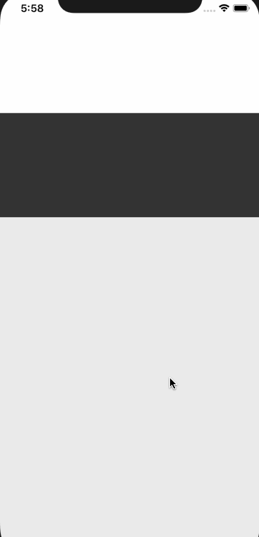
export default CustomModal;The above component is simple. It contains three react native views. On the Container we are using the CSS property position: absolute. The z-index will allow the modal to appear on the top of the HomeScreen component. The Header and the Body are subviews with fixed height.
In order to see this in action, open HomeScreen.js and import it.
// ...
import CustomModal from './CustomModal';

class HomeScreen extends React.Component {
  render() {
    return (
      <Container>
        <CustomModal />
        <ButtonText>Open Modal</ButtonText>
      </Container>
    );
  }
}

// ...
You will get the following result in your simulator.

Great! Now that we can see the Custom Model on the screen, let us start applying some animations. To apply animations in this demo application, we will be using Animated API from React Native. You do not have to install anything rather than import the API from React Native core. Open CustomModel.js and modify it. In the below snippet, also define an initial state.
This initial state value defines an Animated top value to push model up and down.
import React from 'react';
import styled from 'styled-components';
import { Animated } from 'react-native';

class CustomModal extends React.Component {
  state = {
    top: new Animated.Value(900)
  };
  render() {
    return (
      <AnimatedContainer style={{ top: this.state.top }}>
        <Header />
        <Body />
      </AnimatedContainer>
    );
  }
}

const Container = styled.View`
  position: absolute;
  background: white;
  width: 100%;
  height: 100%;
  z-index: 100;
`;

const AnimatedContainer = Animated.createAnimatedComponent(Container);

const Header = styled.View`
  background: #333;
  height: 150px;
`;

const Body = styled.View`
  background: #eaeaea;
  height: 900px;
`;

export default CustomModal;
Right now, the initial top value is receiving an Animated value of 900. The syntax Animated.Value() is used to bind style properties such as we are using with AnimatedContainer. In order to perform animations, the component or the View has to be Animated, thus, you can Animated.createAnimatedComponent() to transform a basic View an Animated one.
Next, define a custom method called toggleModal before the render function. This function will handle the animations to open and close the modal. So far, it is:
componentDidMount() {
        this.toggleModal()
    }

toggleModal = () => {
    Animated.spring(this.state.top, {
        toValue: 174
    }).start()
}
In the above snippet, we are using spring animations using Animated.spring() method. This is used to configure animations based on the analytical values to create a simple spring model based on physics. To read more about this method, take a look at this link in official React Native documentation. The toValue is passed as the second parameter. Lastly, to start an animation, you need to call the method .start().
To trigger this animation on the first render of the component CustomModal, we are using React’s lifecycle method componentDidMount().
You will get the following result.
We need to add a button to close the modal. Let us add the styles and view for the close button on the modal. Create a CloseView component with styled-components library inside a TouchableOpacity button. Also, for the close icon, we are going to use @expo/vector-icons library.
import React from 'react';
import styled from 'styled-components';
import { Animated, TouchableOpacity, Dimensions } from 'react-native';
import * as Icon from '@expo/vector-icons';

const screenHeight = Dimensions.get('window').height;

class CustomModal extends React.Component {
  state = {
    top: new Animated.Value(screenHeight)
  };

  componentDidMount() {
    this.toggleModal();
  }

  toggleModal = () => {
    Animated.spring(this.state.top, {
      toValue: 174
    }).start();
  };

  closeModal = () => {
    Animated.spring(this.state.top, {
      toValue: screenHeight
    }).start();
  };

  render() {
    return (
      <AnimatedContainer style={{ top: this.state.top }}>
        <Header />
        <TouchableOpacity
          onPress={this.closeModal}
          style={{
            position: 'absolute',
            top: 120,
            left: '50%',
            marginLeft: -22,
            zIndex: 1
          }}
        >
          <CloseView style={{ elevation: 10 }}>
            <Icon.Ionicons name="ios-close" size={44} color="blue" />
          </CloseView>
        </TouchableOpacity>
        <Body />
      </AnimatedContainer>
    );
  }
}

const Container = styled.View`
  position: absolute;
  background: white;
  width: 100%;
  height: 100%;
  z-index: 100;
`;

const AnimatedContainer = Animated.createAnimatedComponent(Container);

const Header = styled.View`
  background: #333;
  height: 150px;
`;

const Body = styled.View`
  background: #eaeaea;
  height: ${screenHeight};
`;

const CloseView = styled.View`
  width: 44px;
  height: 44px;
  border-radius: 22px;
  background: white;
  justify-content: center;
  align-items: center;
  box-shadow: 0 5px 10px rgba(0, 0, 0, 0.5);
`;

export default CustomModal;
To calculate the height of a screen’s device, in the above snippet, start by importing Dimensions API. React Native uses Dots Per Inch (DPI) to measure the size (width and height) of a device’s screen. Dimensions.get("window").height allows to gather the screen height. We then use this screenHeight variable in three places. First, the initial state which was before had a static value of 900 is now able to adapt for different devices.
Second, to close the modal or inside closeModal() method. In the toggleModal function we are setting a custom to value of 174 which leaves a partial view of the HomeScreen in the background. If you set this value to 0, the custom modal will cover the whole screen. To close the modal is setting this value to default screen’s height. The TouchableOpacity that wraps the close button invokes the method closeModal.
The third place where the variable screenHeight are the styles of the view container: Body. Please note that box-shadow will not work on Android devices. If you still want to give the close button a shadow, use elevation property as inline styles to CloseView.
You will get the following result in your simulator device.
Integrating Redux to Modal
In this section, you are going to use Redux to manage the state of opening and closing the modal. We have already defined the reducers and actions to serve this purpose. Open CustomModal.js and import the connect High Order Function react-redux library. After that, create two new functions that are somewhat boilerplate code when using a redux in any React or React Native application. These functions are called: mapStateToProps() and mapDispatchToProps().
// ...
import { connect } from 'react-redux';

function mapStateToProps(state) {
  return { action: state.action };
}

function mapDispatchToProps(dispatch) {
  return {
    closeModal: () =>
      dispatch({
        type: 'CLOSE_MODAL'
      })
  };
}

export default connect(mapStateToProps, mapDispatchToProps)(CustomModal);
Next, let us merge the business logic to trigger animations for opening and closing the modal inside the same toggleModal function. The below snippet uses if statements to track the right action coming from the global state.
toggleModal = () => {
  if (this.props.action === 'openModal') {
    Animated.spring(this.state.top, {
      toValue: 174
    }).start();
  }
  if (this.props.action === 'closeModal') {
    Animated.spring(this.state.top, {
      toValue: screenHeight
    }).start();
  }
};
Also, change the value for onPress attribute at the TouchableOpacity to onPress={this.props.closeMenu}. Lastly, componentDidMount() method is going to call toggleModal() only on the initial render which means it is going to be called only once. To resolve this, let us use componentDidUpdate(). This lifecycle method triggers every time there is a new state or change in props.
componentDidUpdate() {
        this.toggleModal()
    }
Integrating Custom Modal to HomeScreen
Since the initial state at the application level right now is empty, you are not going to see the modal trigger, by itself, when you refresh the Expo app. This serves the purpose of keeping the default behavior of the modal to be closed. But top open this custom modal, we are going to add a button on the HomeScreen to activate it.
Open HomeScreen.js and connect it to the redux state like below.
import React from 'react';
import { TouchableOpacity } from 'react-native';
import styled from 'styled-components';
import { connect } from 'react-redux';
import CustomModal from './CustomModal';
class HomeScreen extends React.Component {
render() {
return (
<Container>
<CustomModal />
<TouchableOpacity onPress={this.props.openModal}>
<ButtonText>Open Modal</ButtonText>
</TouchableOpacity>
</Container>
);
}
}
const Container = styled.View`
flex: 1;
justify-content: center;
align-items: center;
`;
const ButtonText = styled.Text`
font-size: 20px;
font-weight: 600;
`;
function mapStateToProps(state) {
return { action: state.action };
}
function mapDispatchToProps(dispatch) {
return {
openModal: () =>
dispatch({
type: 'OPEN_MODAL'
})
};
}
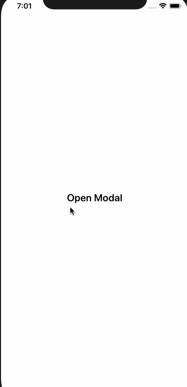
export default connect(mapStateToProps, mapDispatchToProps)(HomeScreen);Click the button Open Modal on the UI screen and you will get similar results as follows.
Congratulations! You have just created a custom model that is animated and integrated it from another screen. You can end this tutorial right here if it serves the purpose or the as the title suggests. Though, if you want to continue, let us add some animations to the HomeScreen to create a pleasing UI in the next section.
Animating HomeScreen
In the HomeScreen component we are going to import quite a few APIs from React Native. The result we are trying to achieve is as follows. It will be easier for you to view what we want to happen to understand the code in this section.
Now that you have seen that let us first go through what are we going to import from react-native.
// ...
import {
  TouchableOpacity,
  StatusBar,
  Animated,
  Easing,
  Platform
} from 'react-native';
In the above demo, we are switching between status bar’s color from dark to light when the modal opens, we are going to use StatusBar inside componentDidMount().
    componentDidMount() {
        StatusBar.setBarStyle("dark-content", true)

        if (Platform.OS == "android") {
            StatusBar.setBarStyle("light-content", true)
        }
    }
Next, we define an initial state to manage Animations with two properties, scale and opacity.
state = {
  scale: new Animated.Value(1),
  opacity: new Animated.Value(1)
};
The create a toggleModal method where most of the things are happening. It gets triggered by componentDidUpdate() lifecycle method just like in the CustomModal component.
componentDidUpdate() {
        this.toggleModal()
    }

    toggleModal = () => {
        if (this.props.action === "openModal") {
            Animated.timing(this.state.scale, {
                toValue: 0.9,
                duration: 300,
                easing: Easing.in()
            }).start()
            Animated.spring(this.state.opacity, {
                toValue: 0.5
            }).start()

            StatusBar.setBarStyle("light-content", true)
        }

        if (this.props.action === "closeModal") {
            Animated.timing(this.state.scale, {
                toValue: 1,
                duration: 300,
                easing: Easing.in()
            }).start()
            Animated.spring(this.state.opacity, {
                toValue: 1
            }).start()

            StatusBar.setBarStyle("dark-content", true)
        }
    }
To trigger the effect HomeScreen shrinking in the background when the modal opens, is achieved by using Animated.timing(). This method maps time range to an easing value. This easing value triggers the Easing module from react native core. This module implements common visualization motions such as bounce, elastic, in (which we are using) and out, cubic, sin, back, ease, linear, quad, inout and many more. To get complete information about Easing, please refer to the docs here.
The Animated.timing() has a default value of 500 milliseconds. We are changing it to 300.
To create partial opacity when the home screen shrinks in the background, we are again using spring animations. Depending on whether the modal is being opened or closed, the style of the StatusBar is being changed by calling the StatusBar.setBarStyle() method.
Here is the complete code for HomeScreen.js file.
import React from 'react';
import {
  TouchableOpacity,
  StatusBar,
  Animated,
  Easing,
  Platform
} from 'react-native';
import styled from 'styled-components';
import { connect } from 'react-redux';
import CustomModal from './CustomModal';

class HomeScreen extends React.Component {
  state = {
    scale: new Animated.Value(1),
    opacity: new Animated.Value(1)
  };

  componentDidMount() {
    StatusBar.setBarStyle('dark-content', true);

    if (Platform.OS == 'android') {
      StatusBar.setBarStyle('light-content', true);
    }
  }

  componentDidUpdate() {
    this.toggleModal();
  }

  toggleModal = () => {
    if (this.props.action === 'openModal') {
      Animated.timing(this.state.scale, {
        toValue: 0.9,
        duration: 300,
        easing: Easing.in()
      }).start();
      Animated.spring(this.state.opacity, {
        toValue: 0.5
      }).start();

      StatusBar.setBarStyle('light-content', true);
    }

    if (this.props.action === 'closeModal') {
      Animated.timing(this.state.scale, {
        toValue: 1,
        duration: 300,
        easing: Easing.in()
      }).start();
      Animated.spring(this.state.opacity, {
        toValue: 1
      }).start();
      StatusBar.setBarStyle('dark-content', true);
    }
  };

  render() {
    return (
      <RootView>
        <CustomModal />
        <AnimatedContainer
          style={{
            transform: [{ scale: this.state.scale }],
            opacity: this.state.opacity
          }}
        >
          <TouchableOpacity onPress={this.props.openModal}>
            <ButtonText>Open Modal</ButtonText>
          </TouchableOpacity>
        </AnimatedContainer>
      </RootView>
    );
  }
}

const RootView = styled.View`
  flex: 1;
  background: black;
`;

const Container = styled.View`
  flex: 1;
  background: white;
  border-top-left-radius: 10px;
  border-top-right-radius: 10px;
  justify-content: center;
  align-items: center;
`;

const AnimatedContainer = Animated.createAnimatedComponent(Container);

const ButtonText = styled.Text`
  font-size: 20px;
  font-weight: 600;
`;

function mapStateToProps(state) {
  return { action: state.action };
}

function mapDispatchToProps(dispatch) {
  return {
    openModal: () =>
      dispatch({
        type: 'OPEN_MODAL'
      })
  };
}

export default connect(mapStateToProps, mapDispatchToProps)(HomeScreen);
In the above snippet, do take note of RootView. We are also converting the good old Container into an Animated view.
Conclusion
This completes this tutorial about creating animated custom modal to provide a pleasant user experience in your react native application. You learned how to use the animated library and some of its methods such as spring, timing along with Easing module. With the help of redux to manage state, you created a custom modal UI.