How to Create a Custom Tab Bar in React Native
React Native is an amazing tool for creating beautiful and high performing mobile applications that run on both iOS and Android. Developing these apps, you might need navigation to navigate from one screen to another. To implement navigation in a React Native app, React Navigation library does an awesome job of providing various navigation patterns such as stack, tabs, and drawer that can be utilized and customize based on the UI design of the app.
In this post, let's create a custom tab bar using React Navigation library bottom tabs component. We are going to create a simple tab bar and then learn how to make it translucent using a Blur view.
Pre-requisites
🔗To follow this tutorial, please make sure you are familiarized with JavaScript/ES6 and meet the following requirements in your local dev environment:
- Node.js version >=
12.x.xinstalled. - Have access to one package manager such as npm or yarn or npx.
- react-native-cli installed, or use npx.
Installing react-navigation library
🔗To create a new React Native app, please execute the following command from a terminal window on your local dev environment. Navigate inside the project directory created by react-native-cli and then install the dependencies:
npx react-native init customTabBarcd customTabBar# install dependenciesyarn add @react-navigation/native @react-navigation/bottom-tabs react-native-reanimated react-native-gesture-handler react-native-screens react-native-safe-area-context @react-native-community/masked-view react-native-vector-icons @react-native-community/blur
Do note that to demonstrate the example described in this article, we are using React Navigation v5 library. After installing these dependencies, please import the Gesture Handler library at the top of the index.js file of your React Native app:
1import 'react-native-gesture-handler';
Then, for iOS, install the Cocoapods for all these dependencies by navigating inside the ios directory in a terminal window and executing the following command. Do note that, if you do not have the Cocoapods installed on your local dev machine, please follow the alternate command as described below:
cd ios && pod install# after pods are installedcd ..# alternate commandnpx pod-install ios
Installing react-native-vector-icons
🔗The react-native-vector-icons module needs a bit more configuration steps for the iOS and Android platforms.
For iOS, you need to add the following inside ios/customTabBar/Info.plist:
1<key>UIAppFonts</key>2<array>3 <string>AntDesign.ttf</string>4 <string>Entypo.ttf</string>5 <string>EvilIcons.ttf</string>6 <string>Feather.ttf</string>7 <string>FontAwesome.ttf</string>8 <string>FontAwesome5_Brands.ttf</string>9 <string>FontAwesome5_Regular.ttf</string>10 <string>FontAwesome5_Solid.ttf</string>11 <string>Foundation.ttf</string>12 <string>Ionicons.ttf</string>13 <string>MaterialIcons.ttf</string>14 <string>MaterialCommunityIcons.ttf</string>15 <string>SimpleLineIcons.ttf</string>16 <string>Octicons.ttf</string>17 <string>Zocial.ttf</string>18 <string>Fontisto.ttf</string>19</array>
Then, the following to the ios/Podfile and run cd ios && pod update from a terminal window:
1pod 'RNVectorIcons', :path => '../node_modules/react-native-vector-icons'
For Android, add the following snippet in the file: android/app/build.gradle:
1apply from: "../../node_modules/react-native-vector-icons/fonts.gradle"
That's it to setup the react-native-vector-icons library.
Since we have installed and configured everything we need to build and run the React Native app, you can now edit the App.js file which is the entry point of the React native app.
To build the app for iOS, please execute the command npx react-native run-ios from a terminal window. Similarly, the build command for Android is npx react-native run-android.
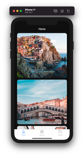
Here is the default app running after the building for iOS:

Add mock screens
🔗The tab bar of this example app is going to display three different tabs. The first tab is used to display a list of items with images such that when the tab bar is added to the app, we can configure its translucency.
Let's create them inside a separate directory called screens/ and create the first file called data.js that contains the mock data to display inside the list view in the first tab. Add the following code snippet:
1// Images in this example demo are being used from Unsplash2// Manarola - https://unsplash.com/photos/rknrvCrfS1k3// Venezia - https://unsplash.com/photos/hFXZ5cNfkOk4// Prague - https://unsplash.com/photos/pz0P5piDQXs56export const data = [7 {8 id: '1',9 title: 'Manarola, Italy',10 description: 'The Cliffs of Cinque Terre',11 image_url:12 'https://images.unsplash.com/photo-1516483638261-f4dbaf036963?ixid=MXwxMjA3fDB8MHxwaG90by1wYWdlfHx8fGVufDB8fHw%3D&ixlib=rb-1.2.1&auto=format&fit=crop&w=633&q=80',13 iconName: 'location-pin'14 },1516 {17 id: '2',18 title: 'Venezia, Italy',19 description: 'Rialto Bridge, Venezia, Italy',20 image_url:21 'https://images.unsplash.com/photo-1523906834658-6e24ef2386f9?ixlib=rb-1.2.1&ixid=MXwxMjA3fDB8MHxwaG90by1wYWdlfHx8fGVufDB8fHw%3D&auto=format&fit=crop&w=630&q=80',22 iconName: 'location-pin'23 },24 {25 id: '3',26 title: 'Prague, Czechia',27 description: 'Tram in Prague',28 image_url:29 'https://images.unsplash.com/photo-1513805959324-96eb66ca8713?ixid=MXwxMjA3fDB8MHxwaG90by1wYWdlfHx8fGVufDB8fHw%3D&ixlib=rb-1.2.1&auto=format&fit=crop&w=634&q=80',30 iconName: 'location-pin'31 },32 {33 id: '4',34 title: 'Venezia, Italy',35 description: 'Rialto Bridge, Venezia, Italy',36 image_url:37 'https://images.unsplash.com/photo-1523906834658-6e24ef2386f9?ixlib=rb-1.2.1&ixid=MXwxMjA3fDB8MHxwaG90by1wYWdlfHx8fGVufDB8fHw%3D&auto=format&fit=crop&w=630&q=80',38 iconName: 'location-pin'39 }40];
In the above code snippet, you can see that data is an array that has different objects. Let's create the first tab screen called Home.js where this array of mock data will be used. Import the following statements inside it and then define a custom and width and height of the image card. This image card is displayed inside the list view as the item. Using React Native's Dimensions API, the width and height of the image are calculated based on the width of the device's screen.
1import React from 'react';2import {3 View,4 Text,5 StyleSheet,6 Image,7 Dimensions,8 ScrollView9} from 'react-native';1011import { data } from './data';1213const { width } = Dimensions.get('screen');1415const ITEM_WIDTH = width * 0.9;16const ITEM_HEIGHT = ITEM_WIDTH * 0.9;
Using a Text component, the title of the tab is displayed. Using the ScrollView the list of items is implemented by using JavaScript's map() method that allows to iterate over each item. After importing the statements, add the following snippet:
1const Home = () => {2 const tabBarheight = useBottomTabBarHeight();3 return (4 <View style={styles.container}>5 <View style={styles.contentContainer}>6 <Text style={styles.title}>Home</Text>7 </View>89 {/* Scrollable Content */}10 <View style={styles.scrollContainer}>11 <ScrollView12 indicatorStyle="white"13 contentContainerStyle={[14 styles.scrollContentContainer,15 { paddingBottom: tabBarheight }16 ]}17 >18 {data.map(item => (19 <View key={item.id} style={styles.imageContainer}>20 <Image21 style={styles.imageCard}22 source={{ uri: item.image_url }}23 resizeMode="cover"24 />25 </View>26 ))}27 </ScrollView>28 </View>29 </View>30 );31};3233export default Home;
Lastly, the add the styles reference for each component in the above snippet:
1const styles = StyleSheet.create({2 container: {3 flex: 1,4 backgroundColor: '#0f0f0f'5 },6 contentContainer: {7 marginTop: 50,8 alignItems: 'center',9 paddingHorizontal: 20,10 paddingBottom: 2011 },12 title: {13 fontSize: 20,14 color: '#fff'15 },16 scrollContainer: {17 flex: 118 },19 scrollContentContainer: {20 alignItems: 'center'21 },22 imageContainer: {23 marginBottom: 1424 },25 imageCard: {26 borderRadius: 14,27 width: ITEM_WIDTH,28 height: ITEM_HEIGHT29 }30});
The other two tab screens are created inside Browse.js and Library.js and they do not render much information other than the name of the tab screen. Let's keep them bare minimum for the brevity of this example.
Inside the file Browse.js, add the following code snippet:
1import React from 'react';2import { View, Text, StyleSheet } from 'react-native';34const Browse = () => {5 return (6 <View style={styles.container}>7 <View style={styles.contentContainer}>8 <Text style={styles.title}>Browse</Text>9 </View>10 </View>11 );12};1314const styles = StyleSheet.create({15 container: {16 flex: 1,17 backgroundColor: '#0f0f0f'18 },19 contentContainer: {20 marginTop: 50,21 alignItems: 'center',22 paddingHorizontal: 2023 },24 title: {25 fontSize: 20,26 color: '#fff'27 }28});2930export default Browse;
Inside the Library.js file, add the following snippet:
1import React from 'react';2import { View, Text, StyleSheet } from 'react-native';34const Library = () => {5 return (6 <View style={styles.container}>7 <View style={styles.contentContainer}>8 <Text style={styles.title}>Library</Text>9 </View>10 </View>11 );12};1314const styles = StyleSheet.create({15 container: {16 flex: 1,17 backgroundColor: '#0f0f0f'18 },19 contentContainer: {20 marginTop: 50,21 alignItems: 'center',22 paddingHorizontal: 2023 },24 title: {25 fontSize: 20,26 color: '#fff'27 }28});2930export default Library;
That's it for the tab screens and mocking data inside one of the tab screen components.
How to create a tab bar
🔗Create a new directory called navigation/ at the root of the React Native project. In this directory, we are going to keep all the navigation configuration files. Inside it create a new directory called TabNavigator. It is going to have two separate files:
index.jsto initiate the complete Tab Bar configurationCustomTabBar.jsto render the custom tab bar
Inside the file TabNavigator/index.js import the createBottomTabNavigator from @react-navigation/bottom-tabs package. Using this, a Tab object is initialized. This object allows defining the structure of the routes using Tab.Navigator and the define each route using the Tab.Screen component.
1import React from 'react';2import { createBottomTabNavigator } from '@react-navigation/bottom-tabs';34import Home from '../../screens/Home';5import Browse from '../../screens/Browse';6import Library from '../../screens/Library';78const Tab = createBottomTabNavigator();910const TabNavigator = () => {11 return (12 <Tab.Navigator>13 <Tab.Screen name="Home" component={Home} />14 <Tab.Screen name="Browse" component={Browse} />15 <Tab.Screen name="Library" component={Library} />16 </Tab.Navigator>17 );18};1920export default TabNavigator;
The simple tab bar configuration is done. To see it in action, let's wrap it with the NavigationContainer component inside the new file called navigation/RootNavigator.js. This component manages the navigation tree. It contains the navigation state prop.
1import * as React from 'react';2import { NavigationContainer } from '@react-navigation/native';34import TabNavigator from './TabNavigator';56const RootNavigator = () => {7 return (8 <NavigationContainer>9 <TabNavigator />10 </NavigationContainer>11 );12};1314export default RootNavigator;
The last step is to import and render the Root Navigator from inside the App.js file:
1import React from 'react';2import { StatusBar } from 'react-native';34import RootNavigator from './navigation/RootNavigator';56const App = () => {7 return (8 <>9 <StatusBar hidden />10 <RootNavigator />11 </>12 );13};1415export default App;
On an iOS simulator, the tab bar is shown as below. There are no custom styles currently applicable on the tab bar. The way it looks is because the tab bar component from React Navigation library has some default styles.

Add icons to the tab bar
🔗To add icons to each tab, first import the Icon component from react-native-vector-icons library inside thenavigation/TabNavigator/index.js` file. For this example, let's use AntDesign based icons.
1// after other import statements2import Icon from 'react-native-vector-icons/AntDesign';
Using the screenOptions object on Tab.Navigator, the configuration to display icons for each tab is enabled. This object has different methods and properties to enable different configurations. One such method is called tabBarIcon that allows us to display a custom icon for each tab. This function returns an Icon component that has props like color and size to apply tint color on the icon for each tab and define a numeric value for the size of the icon. It also has a prop called name
that allows defining which icon to be used for which screen.
Add the following code snippet:
1const screenOptions = (route, color) => {2 let iconName;34 switch (route.name) {5 case 'Home':6 iconName = 'home';7 break;8 case 'Browse':9 iconName = 'appstore-o';10 break;11 case 'Library':12 iconName = 'folder1';13 break;14 default:15 break;16 }1718 return <Icon name={iconName} color={color} size={24} />;19};2021const TabNavigator = () => {22 return (23 <Tab.Navigator24 screenOptions={({ route }) => ({25 tabBarIcon: ({ color }) => screenOptions(route, color)26 })}27 >28 {/* rest remains same */}29 </Tab.Navigator>30 );31};
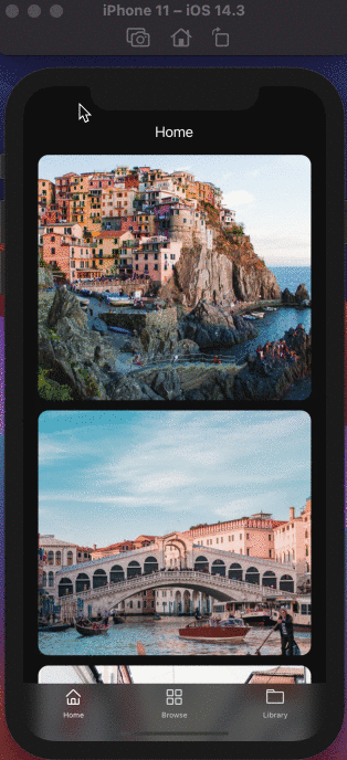
Go back to the iOS simulator and you will notice that the icons for each tab route are now displayed.
Customizing the tab bar
🔗To customize a tab bar, more options using the tabBarOptions object can be applied. This options object has properties to set active and inactive tint color for each tab, the background color for the whole tab bar, and so on.
Add the following options object on Tab.Navigator:
1<Tab.Navigator2// ...3tabBarOptions={{4 activeTintColor: 'white',5 inactiveTintColor: '#d9d9d9',6 style: {7 borderTopColor: '#66666666',8 backgroundColor: 'transparent',9 elevation: 0,10 },11}}12>
The property elevation is set to zero in the above code snippet such that there are no shadows overlap on Android when we will make the custom tab bar translucent in the next section.
Making the tab bar translucent
🔗To make the tab bar translucent, we are going to use BlurView component from @react-native-community/blur component. It is used to add a blur view effect on iOS and Android. It is going to wrap a component called BottomTabBar from @react-navigation/bottom-tabs library. This component is a React element that is used to display the actual tab bar. It is provided by a prop called tabBar on Tab.Navigator. Using this React element, the tab bar can be defined explicitly inside the CustomTabBar.js component file.
Start by adding the following snippet inside TabNavigator/CustomTabBar.js file:
1import React from 'react';2import { BottomTabBar } from '@react-navigation/bottom-tabs';3import { BlurView } from '@react-native-community/blur';45const CustomTabBar = props => {6 return <BottomTabBar {...props} />;7};89export default CustomTabBar;
The props received by this custom React component are passed from tabBar option. Add it on the Tab.Navigator inside TabNavigator/index.js file:
1<Tab.Navigator2 // ... rest remains same3 tabBar={(props) => <CustomTabBar {...props} />}4>
Using the props you can further modify the configuration of a bottom tab bar. We are not going to get into that since it's out of the scope of this article.
Inside the CustomTabBar.js file, wrap the BottomTabBar with <BlurView> component. It has a different set of props for iOS and Android to add the blur view effect.
For iOS, to create a blur view effect, add blurType which accepts the type of blur effect as a string value. On an iOS device, different values such as light, dark, xlight, regular etc. are available.
Another property blurAmount is applied to adjust the intensity of the blur effect. Similarly, for Android, in addition to these props, props such as overLayColor to set a custom overlay and blurRadius to manually adjust the blur effect radius are used.
To make sure to apply styles on the BlurView component such that the tab bar is displayed over the content of each screen, set its position to absolute.
Here is the final snippet for CustomTabBar component:
1<BlurView2 style={{3 position: 'absolute',4 bottom: 0,5 left: 0,6 right: 07 }}8 blurType="dark"9 blurAmount={10}10 blurRadius={25}11 overlayColor="transparent"12>13 <BottomTabBar {...props} />14</BlurView>
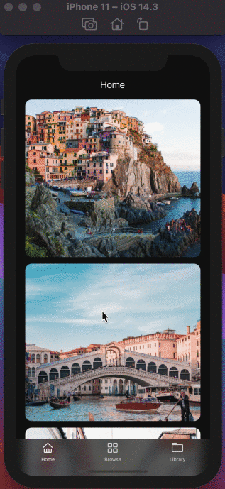
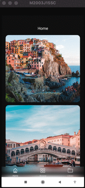
The tab bar is now translucent. Here is the example app running on an iOS simulator.

Do notice that, since the BlurView component has the position set to absolute we need to apply the paddingBottom property at the ScrollView component inside the Home.js tab screen. The value of this property is going to be the height of the whole tab bar. To get the height of the current tab bar, the @react-navigation/bottom-tabs module has a hook called useBottomTabBarHeight that gives this value.
Add the import statement in the screens/Home.js file and inside it, use the hook to get the height as shown below and apply it as the value of the paddingBottom style property at the ScrollView component:
1import {useBottomTabBarHeight} from '@react-navigation/bottom-tabs';23// ...45const Home = () => {6 const tabBarheight = useBottomTabBarHeight();78 // ...910 return (11 // ...12 <ScrollView13 indicatorStyle="white"14 contentContainerStyle={[15 styles.scrollContentContainer,16 {paddingBottom: tabBarheight},17 ]}>18 )19}
Back in the iOS simulator, you will notice that it works fine now:

Running the app build on an Android device, the results are similar:

Conclusion
🔗We have discussed only one scenario of customizing the bottom tab bar. The main objective here is to get familiar with the component-based configuration of the Tab Navigator in the latest version of the react-navigation library and learn the steps to create a custom tab bar. Originally Published on Crowdbotics's Blog.
More Posts
Browse all posts
I'm a software developer and a technical writer. On this blog, I write about my learnings in software development and technical writing.
Currently, working maintaining docs at 𝝠 Expo. Read more about me on the About page.